
The Shape of Process: What Data's Distribution Reveals
The Question: If Not the Average, Then What?
You have been trained to trust the average. It’s the first number you look for, the single metric you use to gauge performance, and the bedrock of countless business decisions. But what if this number, the one you rely on, is actively misleading you?
The average reduces a complex reality to a single data point, concealing the variations and outliers that contain the most valuable information. This raises a critical question: If the average is a flawed guide, what is the alternative?
A call center manager, Jane, sees the flaw of the average firsthand. Her target of an “average” eight-minute call pleases no one. It’s a meaningless number in a system with huge variation. She is left searching for a better way to understand her team’s performance.
The Clue: The Shape of the Data
The answer to the question begins by looking not at a single point, but at the full picture. The alternative to the average is the distribution—a map that plots the frequency of every possible outcome. It reveals the full landscape of the data, answering the questions the average ignores: Where does the data cluster? How wide is the spread? Is it symmetrical or skewed?
This shape is not an arbitrary pattern; it is a clue. It is a trail of evidence that points to the nature of the system that created it.
Frustrated, Jane plots every call time on a graph. She sees a massive spike at one minute and a long, thin tail stretching for hours. The shape is the clue. It’s a map of her reality, and it looks nothing like she expected.
The Answer: The Process Is the Shape
Here is the crucial insight, the answer to our question: the shape of the data’s distribution is a direct fingerprint of the underlying process that generated it. This is the conceptual leap that moves us from mere measurement to true understanding. Different kinds of processes create different kinds of shapes. By learning to read the shape, we can diagnose the nature of the system itself.
This concept becomes clear when we see it in action. Let’s look at two fundamentally different processes and the data shapes they produce.
Jane has her answer. The shape of her data tells her she isn’t running one process, but two. The spike is an “Express Lane” process for simple problems. The tail is a “Deep Dive” process for complex ones.
The Bell Curve Process: A World of Similar Tasks
The first type of process is driven by many small, independent factors, resulting in outcomes that are variations on a single theme. Imagine a call center focused exclusively on one task: scheduling annual check-ups for a clinic. The script is fixed, a task is uniform, and the duration of each call will only vary slightly due to factors like connection speed, the client’s pace of speech, or minor clarifications.
Plotting these call times would produce a Normal Distribution—a “bell curve.” The calls would cluster predictably around an average, and very long or very short calls would be rare. In this process, the system is stable, and the average is a reliable guide to a typical event.
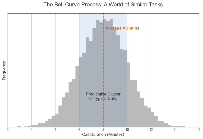
Jane initially assumed her call center operated this way, like a scheduling center where every call is a variation of a single, stable process. The average would have been a meaningful target in that world.
The Long-Tail Process: A Few Decisive Factors
The second type of process is driven by a few disproportionately powerful factors. Consider the call times in a technical support center. The vast majority of calls are simple issues like password resets, which are resolved in moments. This creates a huge spike—a “short head”—at the beginning of the distribution.
However, a small number of calls involve complex, novel problems that require hours of deep investigation. These rare but high-impact events create a “long tail” that stretches far to the right. In this process, the average is a meaningless fiction, representing neither the common quick call nor the rare marathon session. The system is defined not by its center, but by its extremes.
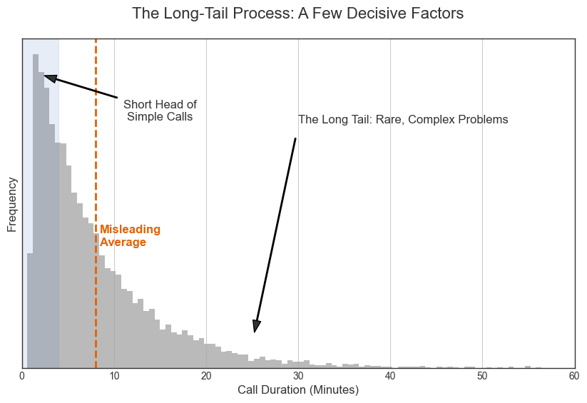
The data’s shape revealed Jane was actually in a long-tail world. Most calls were trivial (the short head), while a few complex calls were enormously time-consuming (the long tail). The average was a fiction that represented neither.
Strategy Must Align with Structure
Recognizing the shape of your data is more than an analytical exercise; it is the essential prerequisite for sound strategy. The failure to do so is what leads to predictable disaster. A mismatched strategy—one that applies the logic of one system to the reality of another—will inevitably fail. You cannot manage a long-tail process with a bell-curve mindset.
A bell-curve process benefits from a strategy of optimization and efficiency around the mean. A long-tail process requires a dual strategy: one approach for handling the high volume of trivial events in the head, and a completely different one for identifying and capitalizing on the rare, high-impact events in the tail.
Jane abandons the one-size-fits-all average. She creates two specialized teams: an Express Team for the high-volume, simple calls, and a Specialist Team for the complex, long-tail calls. She designs different goals and processes for each.
Conclusion: The Answer Is the Shape
We began with a question: If the average is a flawed guide, what is the alternative? The answer is the shape of the data. It is a map to the underlying process that governs your system.
The goal of data analysis is not to generate a single number, but to gain insight. By moving from the average to the distribution, we graduate from managing by a single, misleading metric to leading with a clear-eyed view of reality. Stop managing the number. Start understanding the shape. The former is measurement; the latter is insight.
The new strategy is a success. Customer satisfaction soars for both simple and complex issues. By matching her strategy to the true shape of the data, Jane fixed the system, not just the metric.
Leave a Comment